Kids Foundation Rebrand
Bridegan Foundation
This project was deeply personal from the start. Kirsten Bridegan came to us after founding her non-profit in the wake of a profound personal loss. As the organization gained momentum she needed a brand system that felt more credible and established to help resonate with larger donor and partners, without losing it’s personality. We are so proud of how it turned out, despite the challenge of making sure the branding simultaneously felt personal to the founder, well-established, and spoke to the foundation’s purpose of supporting children affected by crime and chaos.
Branding Illustration Design Merch
OUR ROLE:
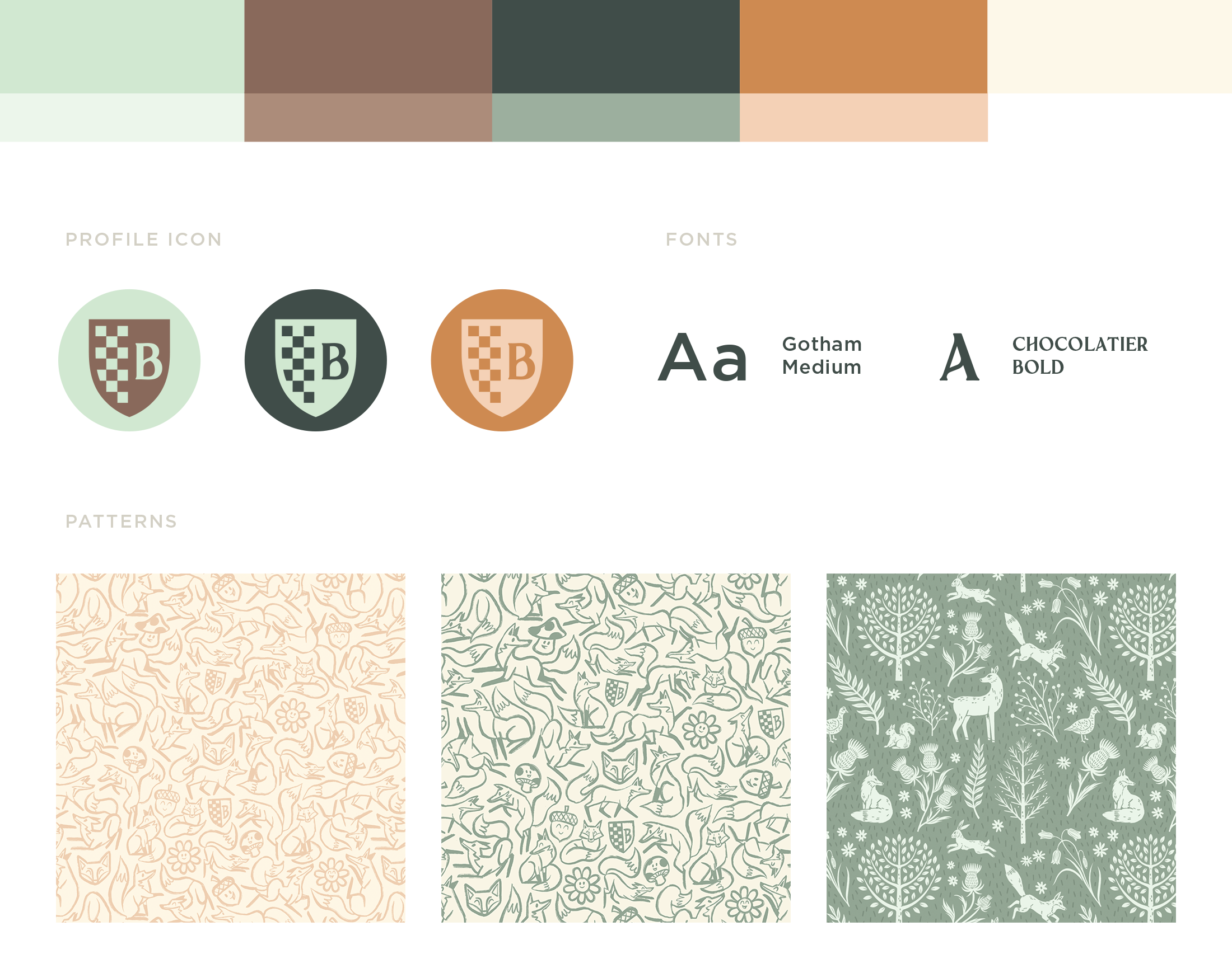

The Deeper Meaning
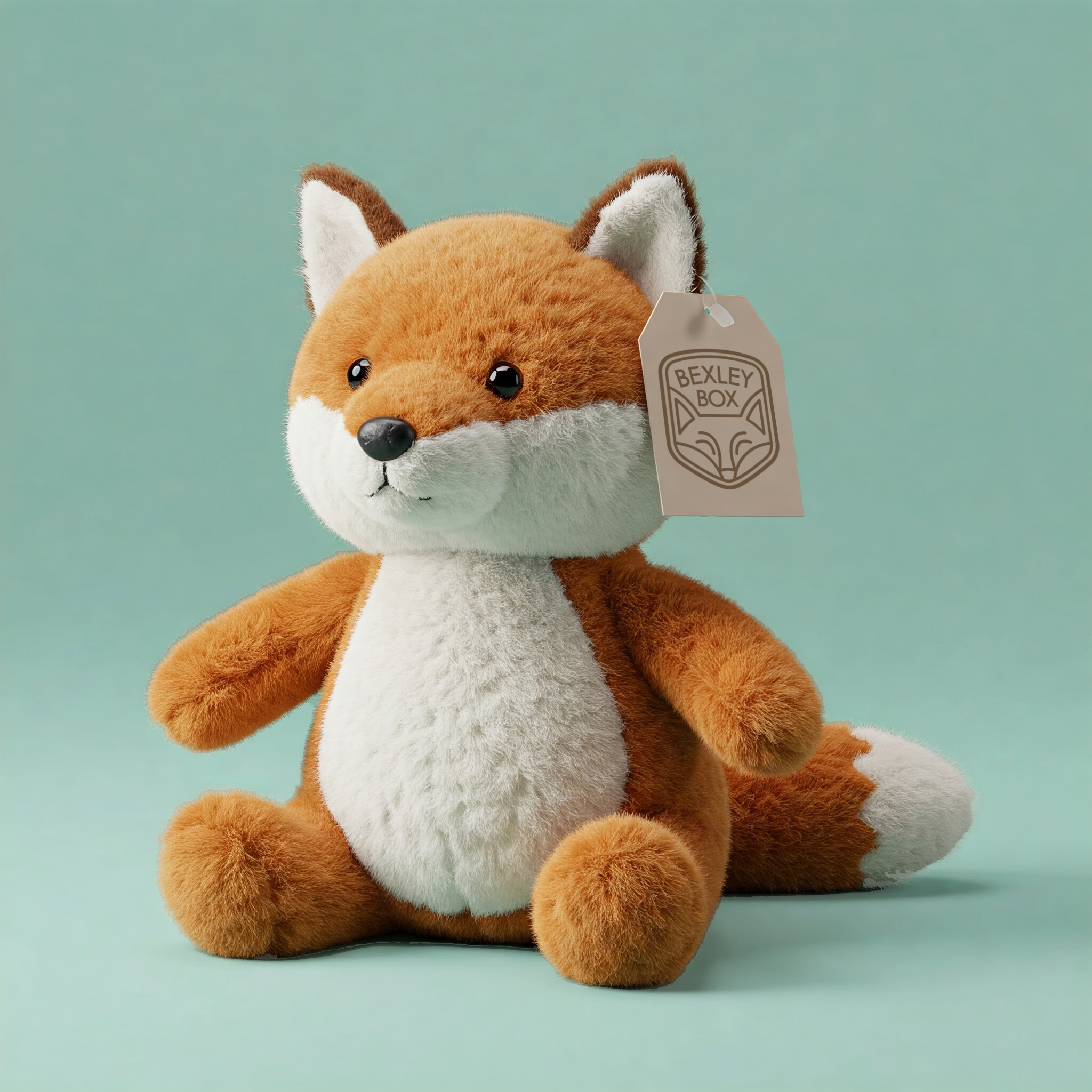
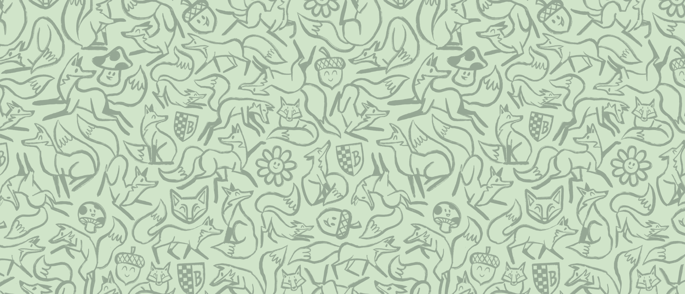
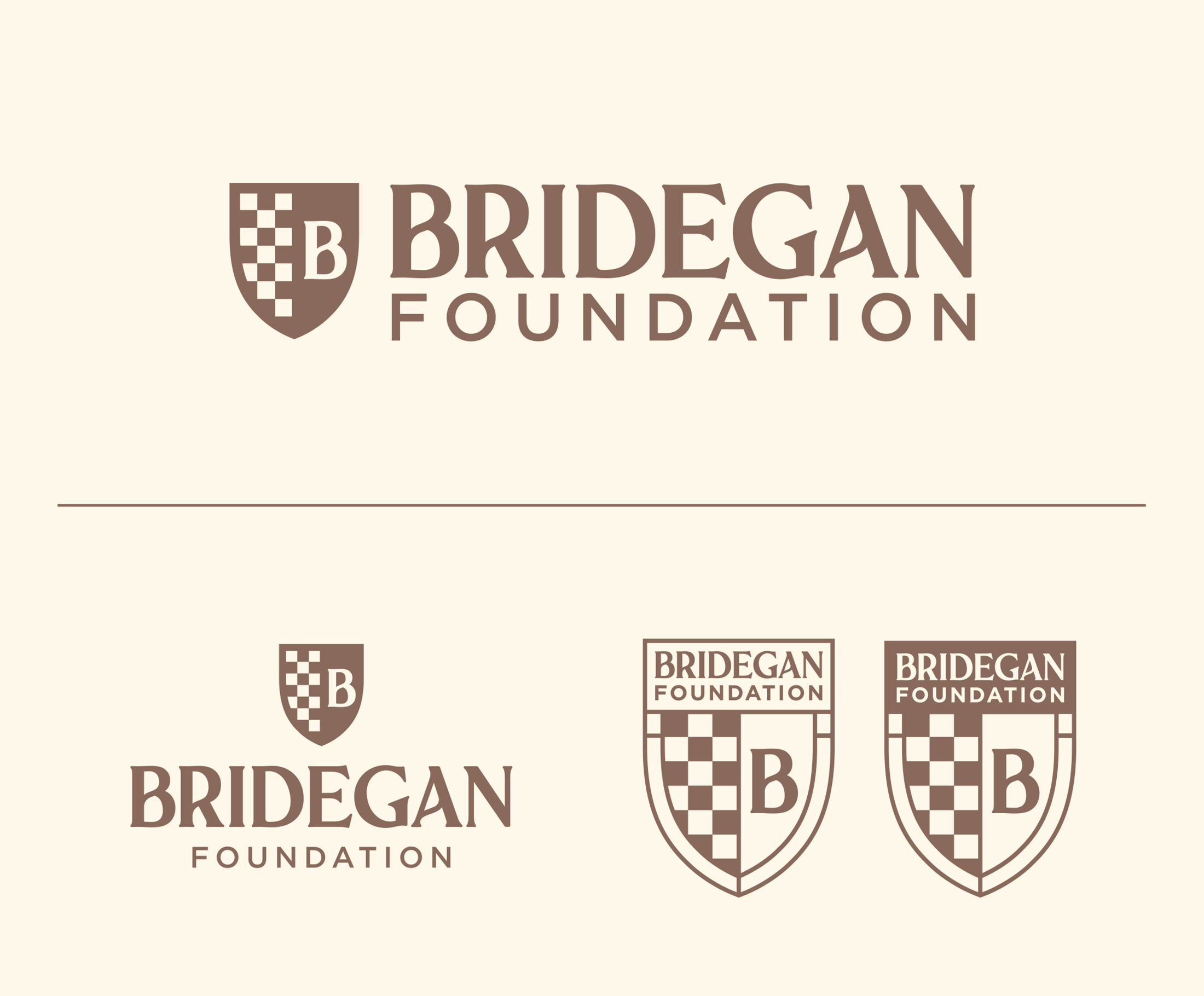
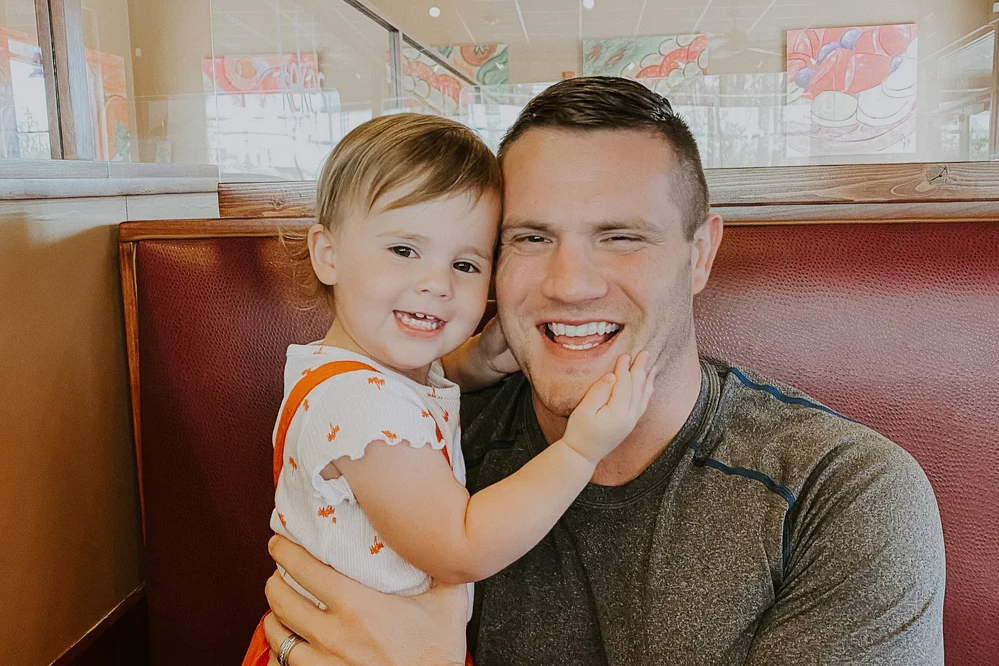
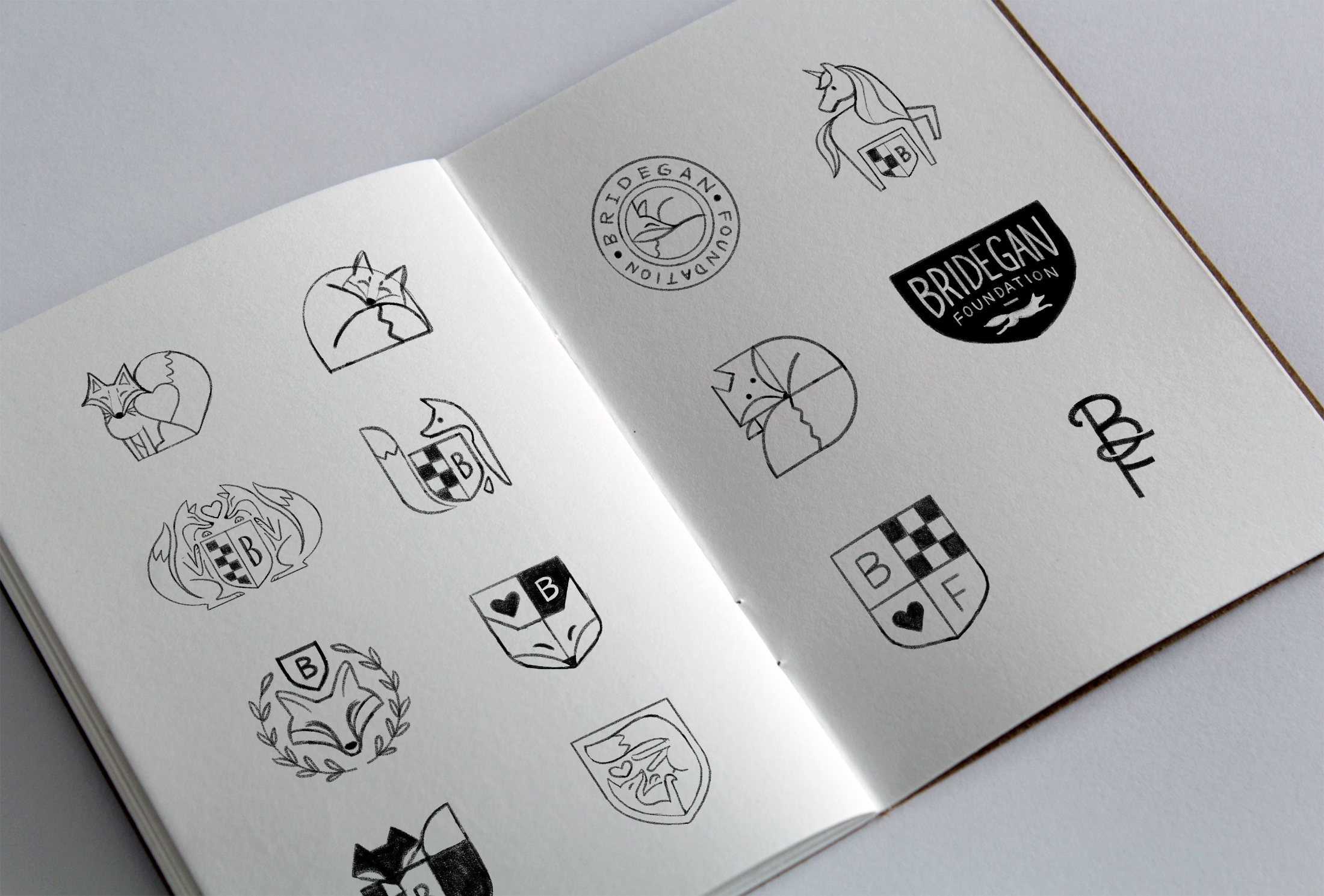
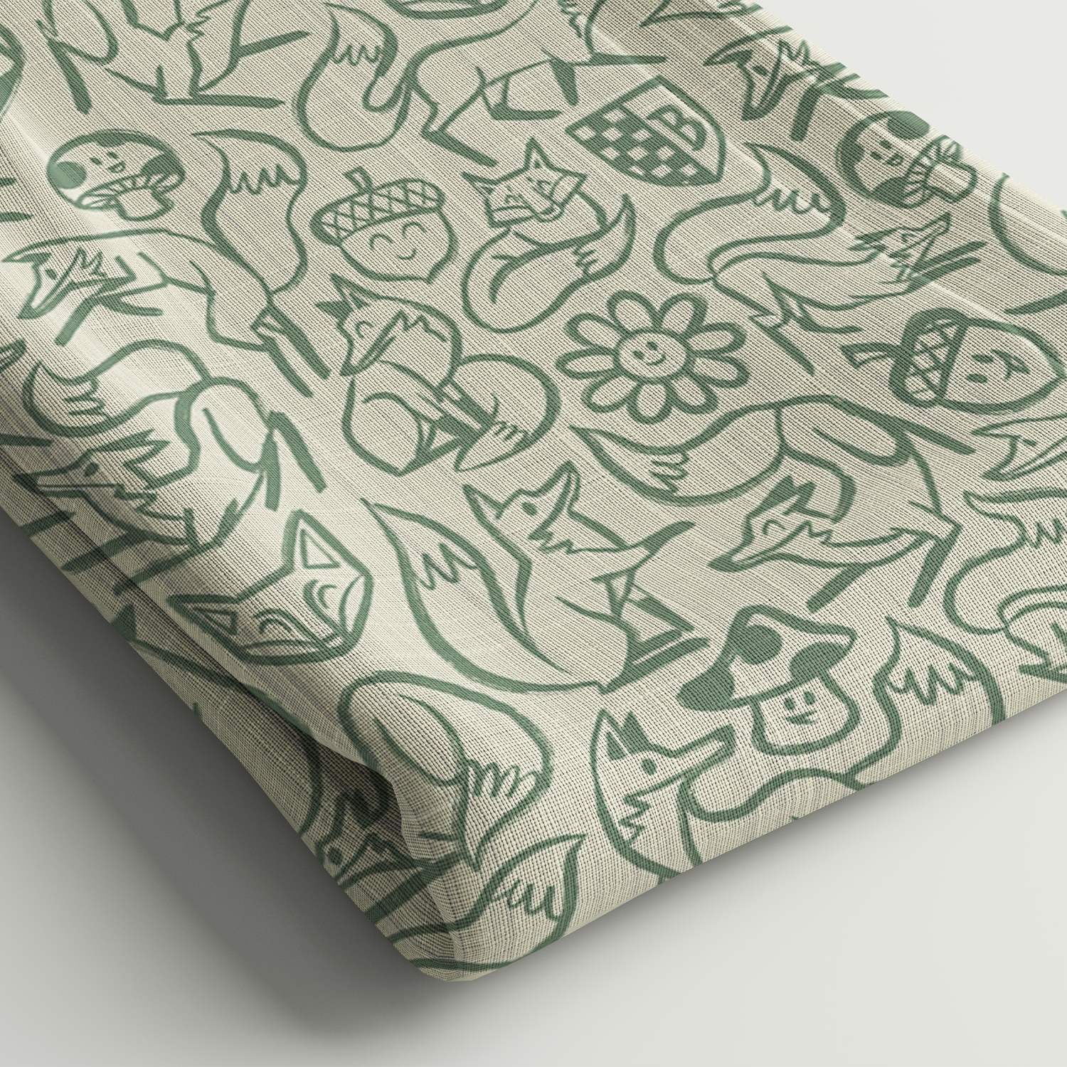
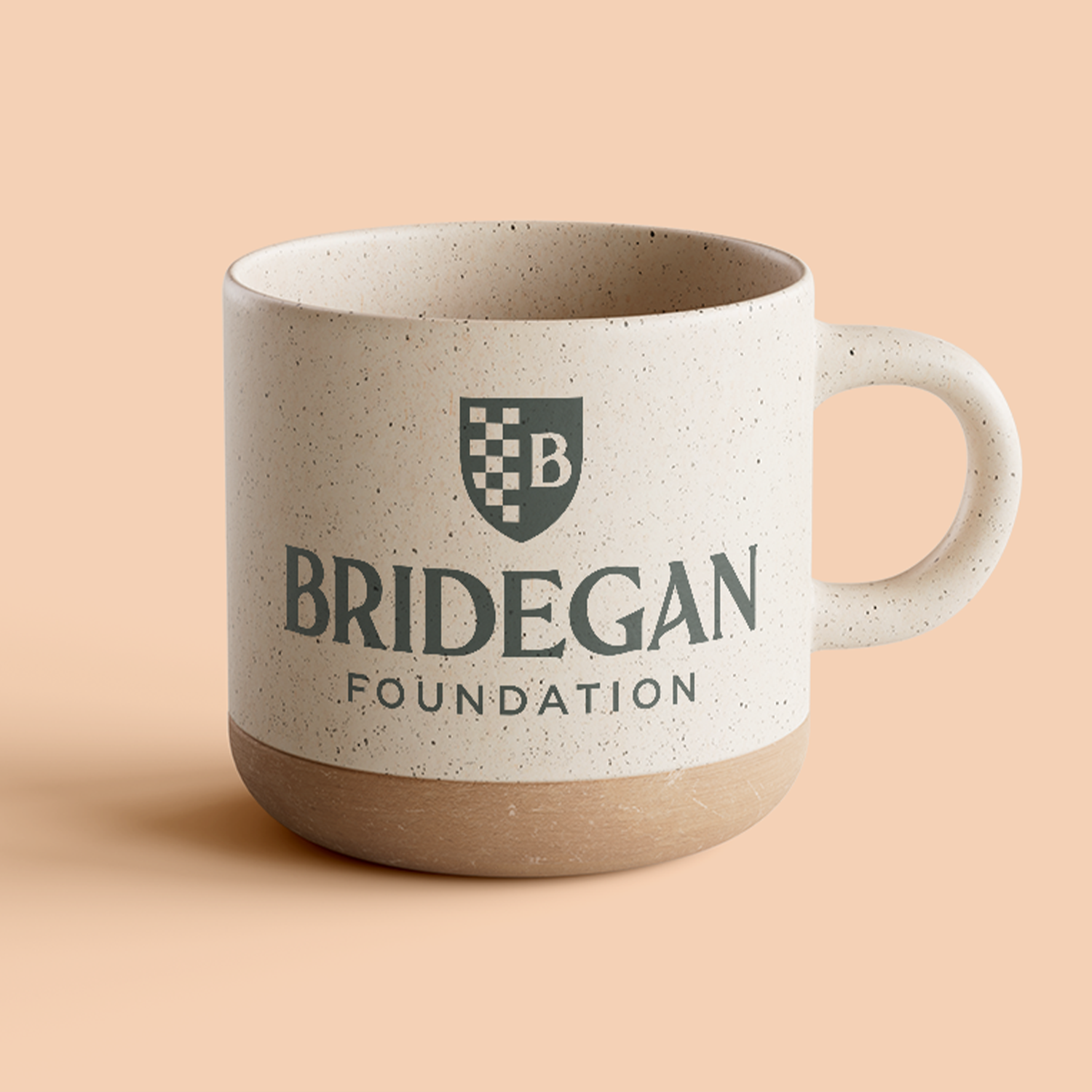
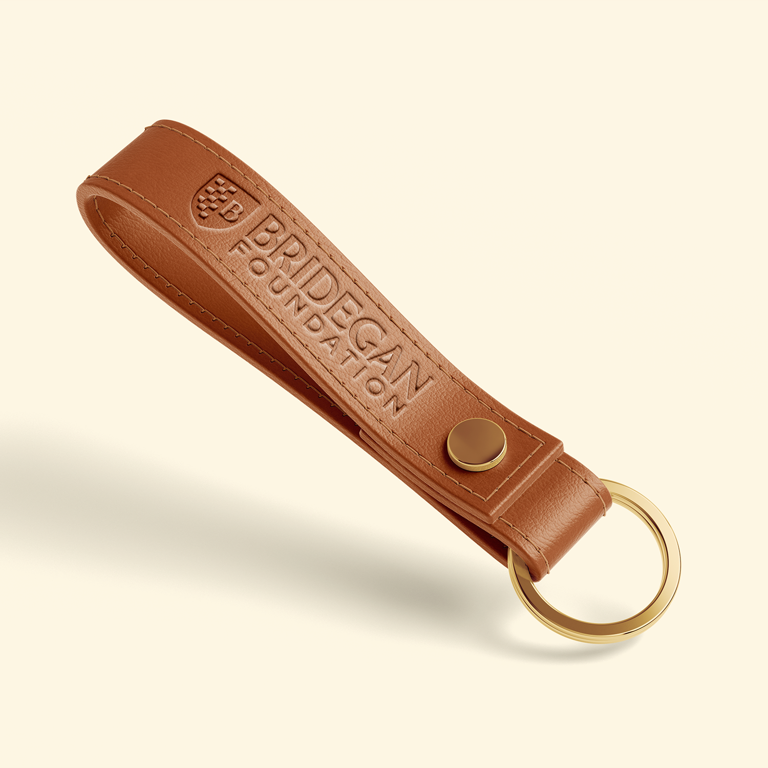
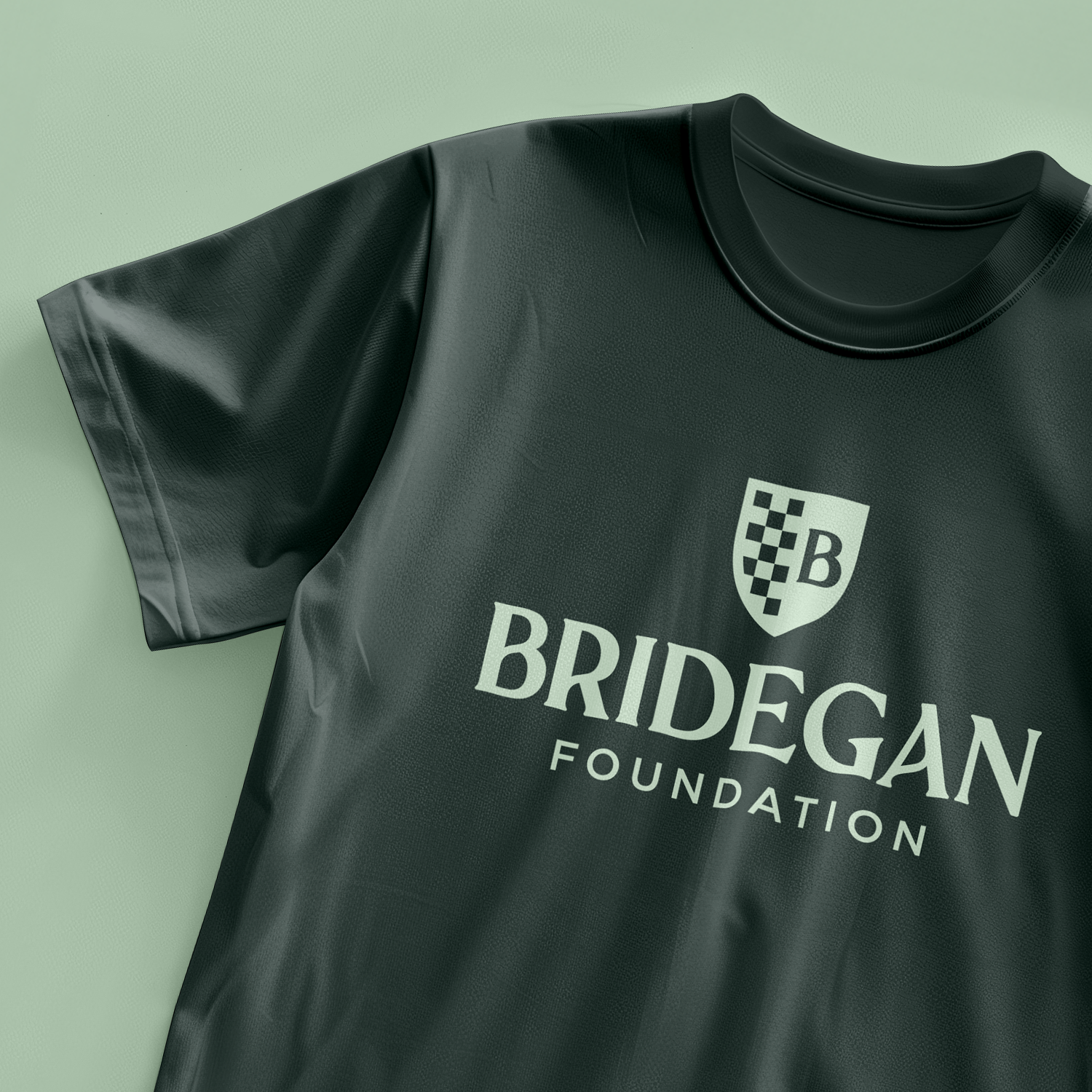
The Bridegan Foundation was created after the tragic murder of Kirsten’s husband, Jared Bridegan, in 2022. To give the logo an established feel while incorporating a meaningful nod to her family, we developed the idea of a family crest inspired by the Scottish roots of their last name. This reinforced through the color palette and the inclusion of a fox in the brand. Which, fun fact, is also a tribute to a ceramic fox their daughter Bexley painted with her dad.
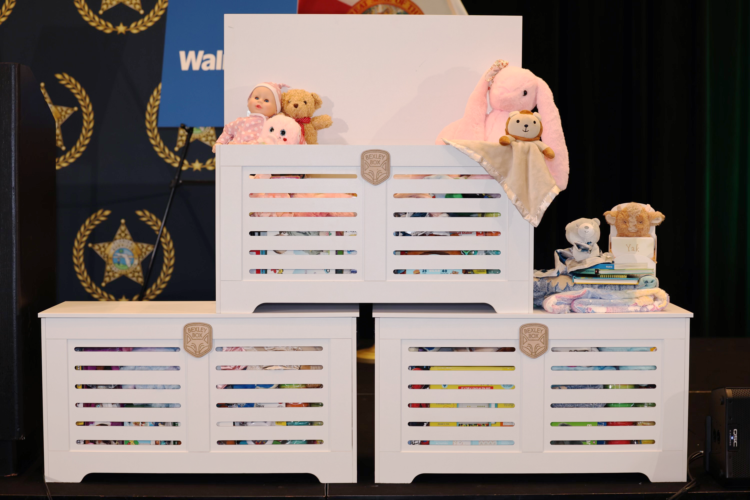
The Bexley Box
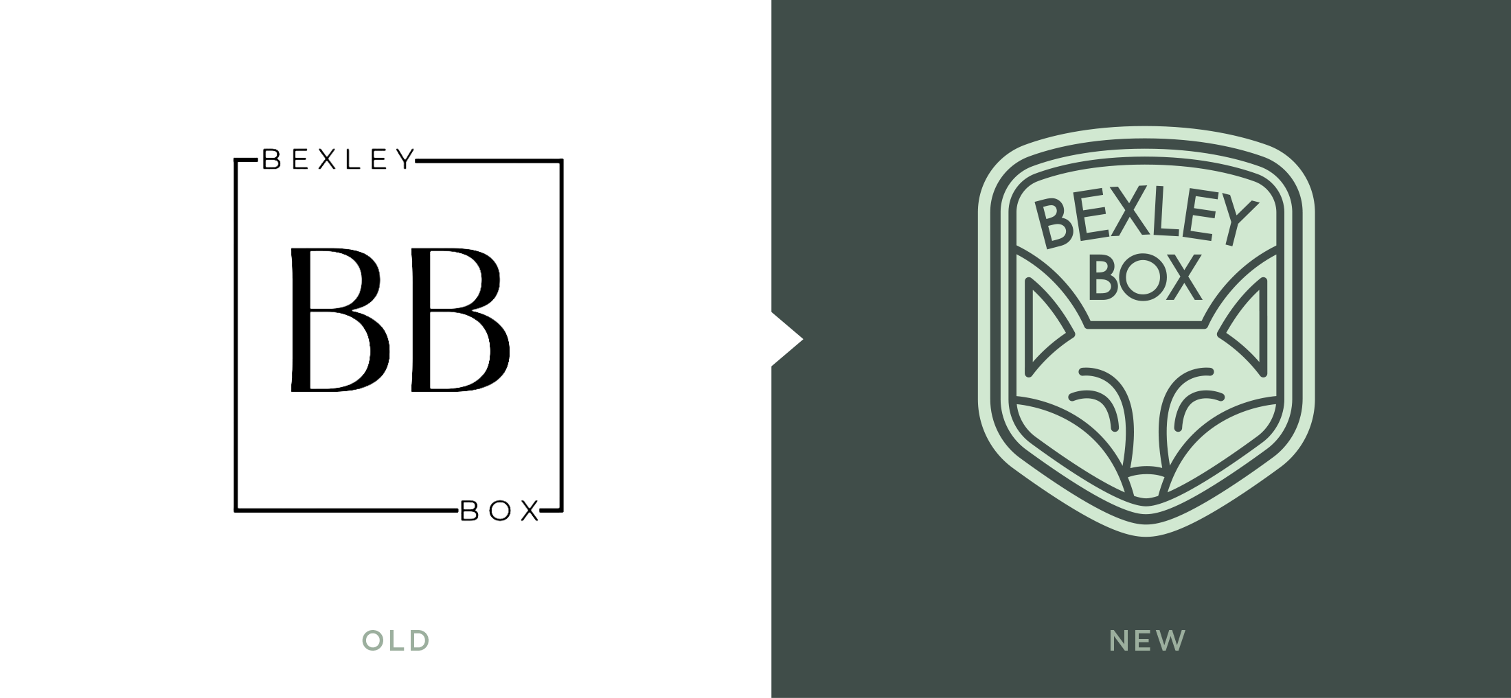
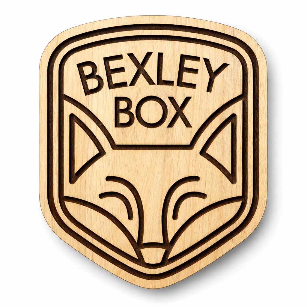
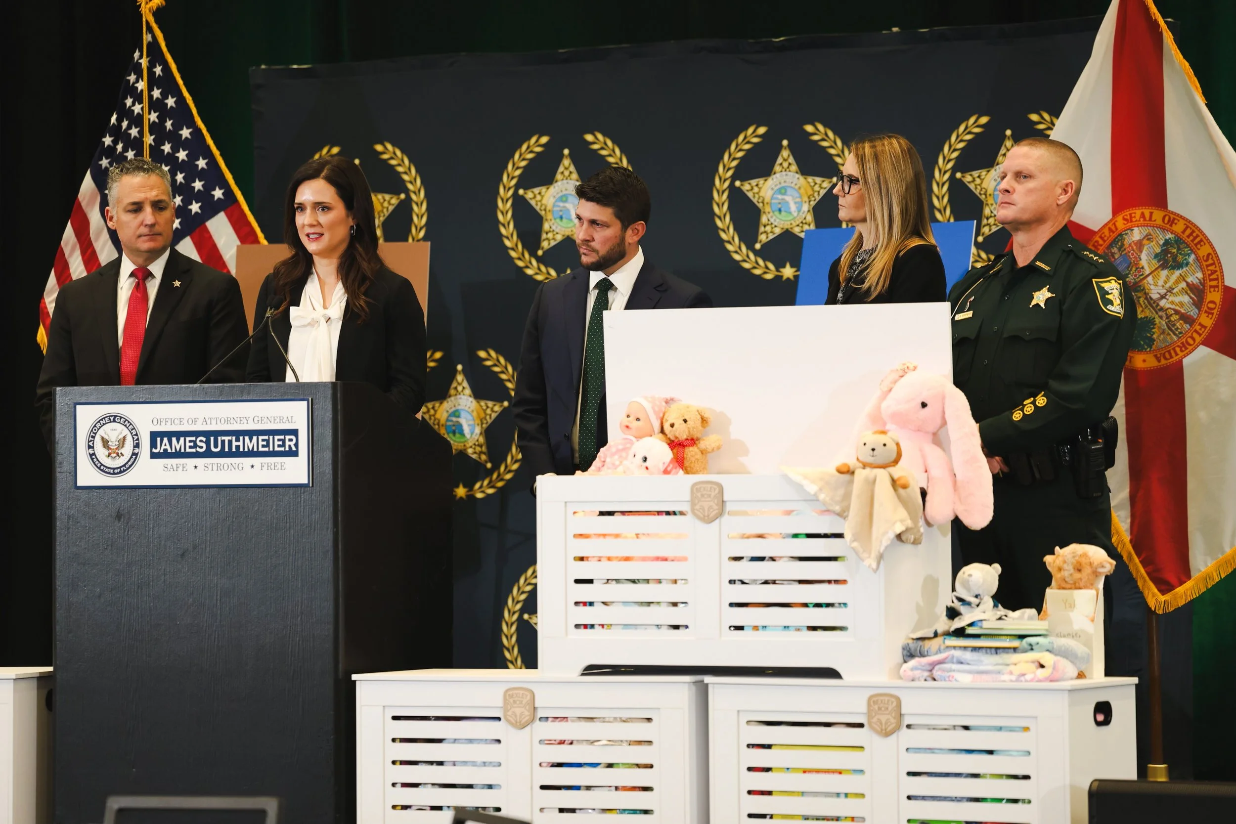
These boxes are the heart of the Bridegan Foundation’s work, carefully assembled comfort kits delivered to police stations to support children in moments of crisis and uncertainty. Added to the front of each box is a woodcut Bexley Box badge, which we also redesigned. It had to feel cohesive with the foundation’s brand, but feel more warm and approachable for kid. Our solution was a simple, friendly fox.

